A BRAND NEW LOOK TO A DISTRIBUTION COMPANY
Oncoexo est une société de distribution de médicaments qui opère dans le nord-est du Brésil depuis plus de 10 ans. Avec la nécessité de mettre à jour l'image institutionnelle et de repositionner l'entreprise au Brésil, j'étais responsable de tous les travaux impliquant le branding, du développement de la marque aux projets numériques.
Oncoexo is a drug distribution company that has been operating throughout Northeast Brazil for over 10 years. With the need to update the institutional image and reposition the company throughout Brazil, I was responsible for all work involving branding from brand development to digital projects
THE STRATEGY BEHIND THE VECTOR
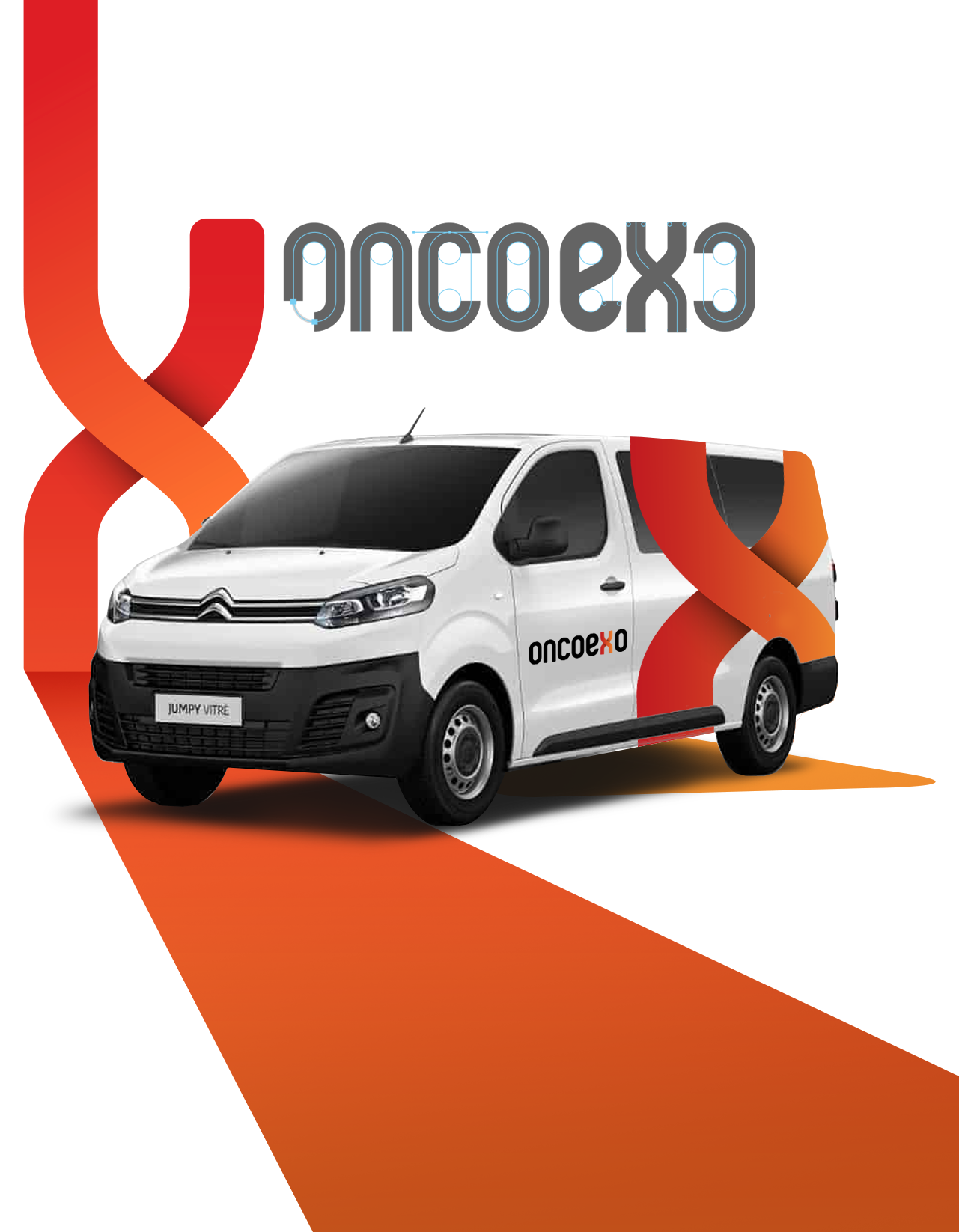
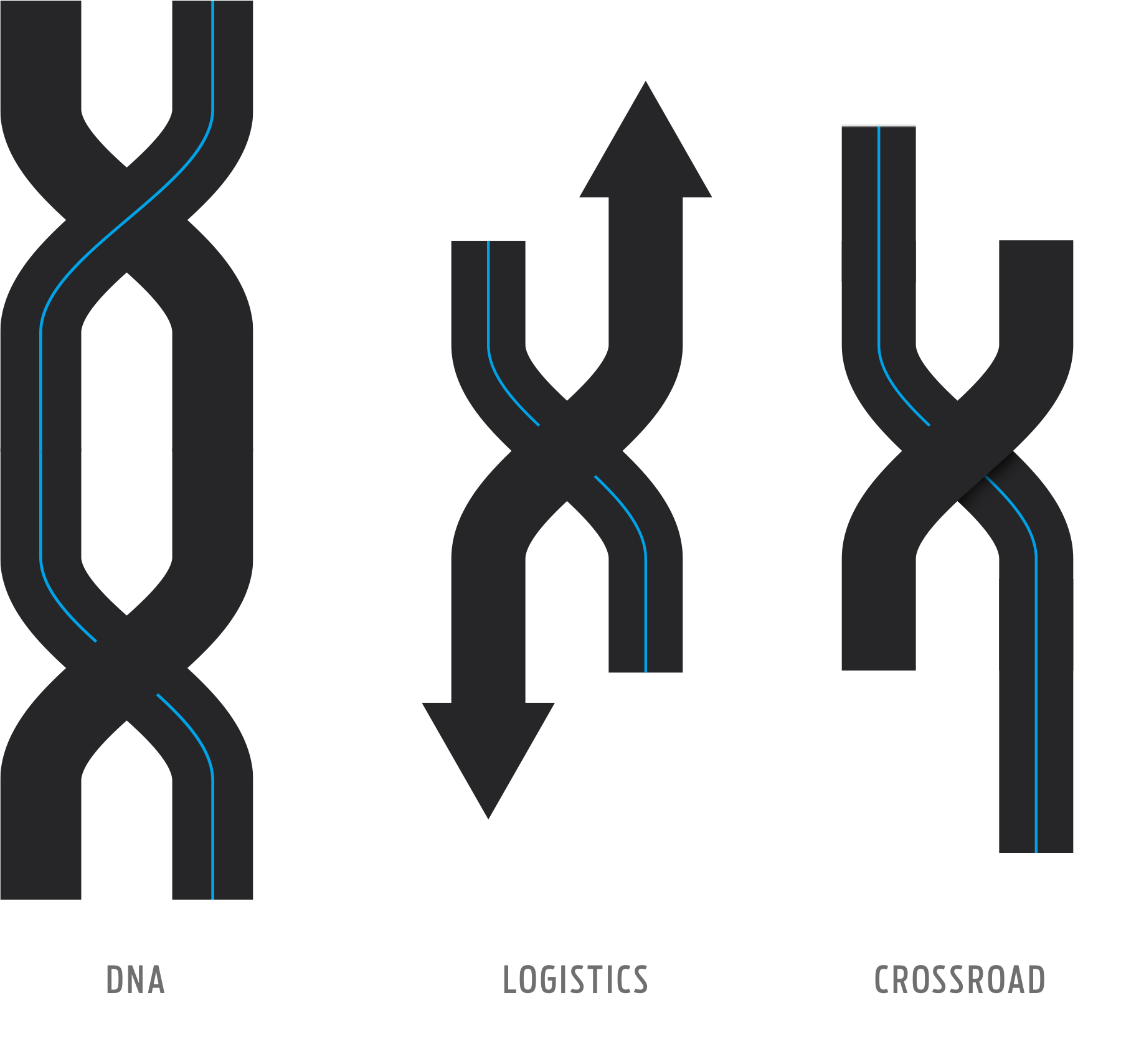
Tout le travail de développement était basé sur le concept d'apporter de l'agilité à la marque et de la positionner exactement sur le marché où elle opère. Pour cela, le «X» est devenu le symbole principal où il représente à la fois une intersection (faisant référence à la logistique), une chaîne ADN (faisant référence à l'industrie pharmaceutique) et enfin l'agilité (faisant référence à l'agilité avec les clients).
All development work was based on the concept of bringing agility to the brand and positioning it exactly in the market where it operates. For this, the "X" has become the main symbol where it represents at the same time an intersection (referring to logistics), a DNA chain (referring to the pharmaceutical industry) and finally agility (referring to agility with customers ).

THE LOGO CONCEPT
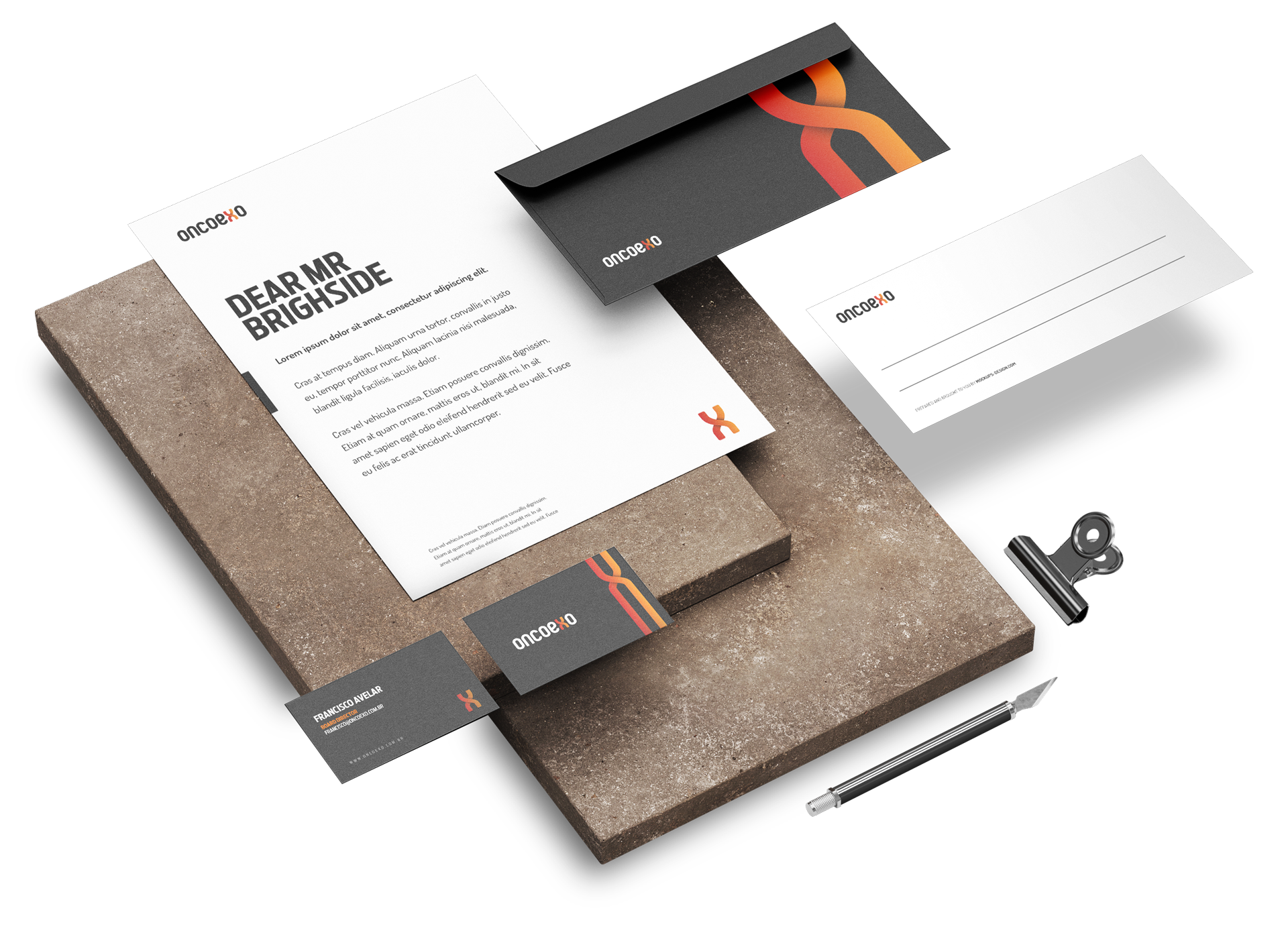
Le logo développé pour ce projet est parti de la simplicité, mais avec raffinement et modernité. L'idée derrière le concept de marque était de combiner une typographie audacieuse avec un symbole qui transmettait le sérieux et l'engagement. Pour cela, j'ai utilisé les initiales de chaque partenaire avec des couleurs vives, qui, combinées, apporteraient vie et sophistication jamais vues parmi les bureaux traditionnels.
The logo developed for this project started from something simple, but with refinement and modernity. The idea behind the brand concept was to combine bold typography with a symbol that conveyed seriousness and commitment. For this I used the initials of each partner with strong colors, which when combined would bring life and sophistication never seen among the traditional offices.
PRESENTATION
Un travail spécifique de direction photographique a également été réalisé afin de transmettre le concept principal du bureau. Un nouveau modèle d'avocats a été proposé, plus souple, sans formalités et sans lien.
A specific work of directing photography was also carried out so that the main concept of the office was passed on. A new model of lawyers was proposed, looser, without formalities and with no ties.
WEB POSITIONING
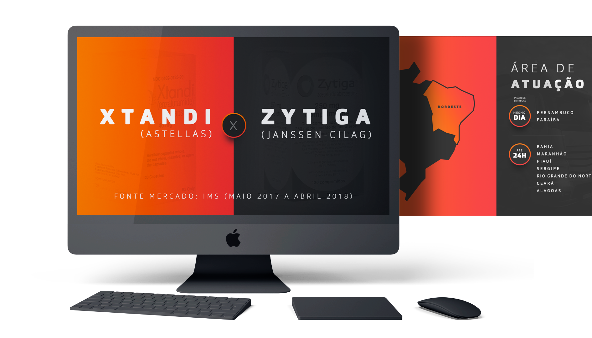
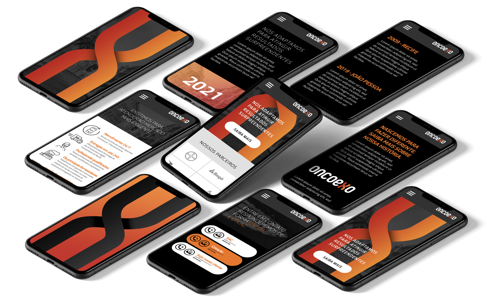
Le travail ne serait pas complet sans le digital, afin de transmettre ce qu'il avait accompli dans l'architecture, le design de marque et la photographie, un design moderne et audacieux, avec des lignes fines et une combinaison de couleurs pour attirer l'attention a été développé. Le tout avec un seul objectif: se démarquer des autres.
The work would not be complete without digital, so to convey what he had accomplished in architecture, brand design and photography a modern and bold design, with fine lines and a combination of colors to attract attention was developed. All with a single objective: to stand out among the rest.
If you have a great idea and want to make it happen, or want to reposition yourself in the market with new experiences and results send me an email.
All rights reserved