CREATING A PRODUCT FROM ZERO TO HERO
Bold est une nouvelle catégorie de boissons dans le segment sain. Énergique, diurétique et hypocalorique, Bold est née pour être une option saine à tous et à toutes qui se soucient de la longevité. L'objectif c'est de proposer quelque chose de nouveau, jeune et attrayant, qui attirerait l'attention des gens sur un design et une image de marque clean.
Bold is a new category of drinks in the healthy segment. Energetic, diuretic and low-calorie, Bold was born to be a healthy option for everyone who cares about longevity. The objective is to offer something new, young and attractive, which would draw people's attention to a clean design and brand image.
A STRONG IDENTITY THAT CARRY THE NAME
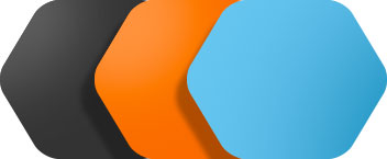
Avec des formes allongées et une typographie simple, le développement de la marque a commencé pour une meilleure présentation dans les points de vente, se démarquant par la forme et les couleurs. La couleur bleue a été soigneusement choisie pour être unique et la forme de l'hexagone comme symbole.
With elongated shapes and simple typography, the development of the brand started for a better presentation at the points of sale, standing out in form and colors. The blue color was carefully chosen to be unique and the shape of the hexagon as a symbol.
WHY CHOOSE THIS FORM?
La forme choisie pour donner vie à la marque est la même que j'ai choisie pour être la forme des flacons. Parce qu'ils auraient un design unique et prendraient moins de place dans la zone de stockage. Économiser de l'espace physique.
The shape chosen to give life to the brand is the same one I chose to be the shape of the bottles. Because they would have a unique design and would take up less space within the storage area. Saving physical space.
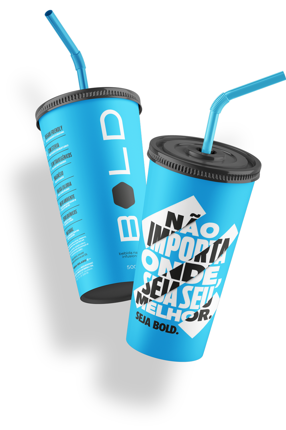
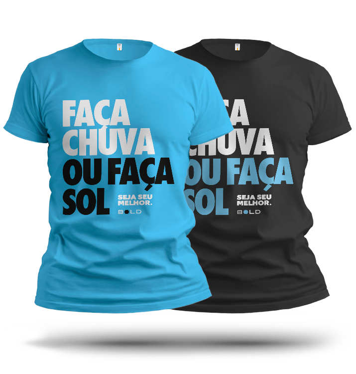
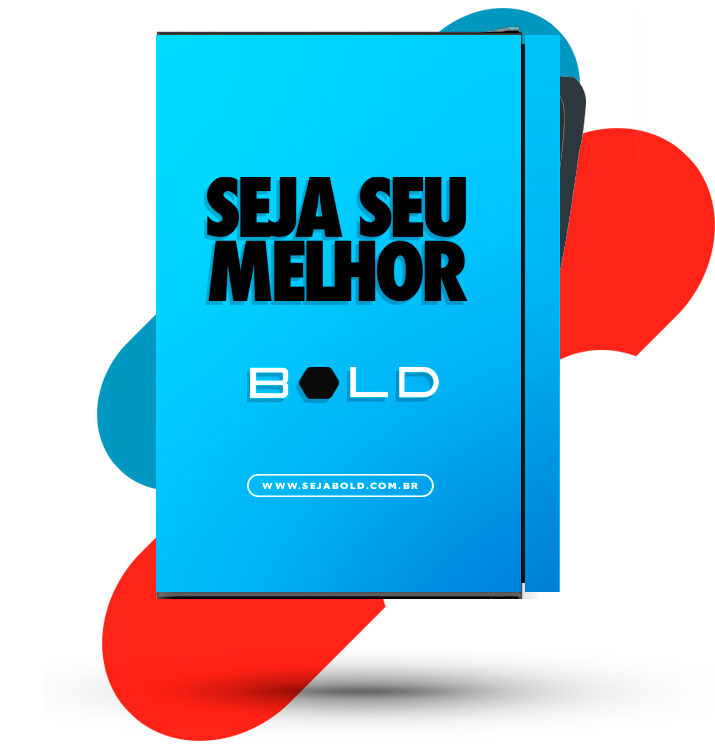
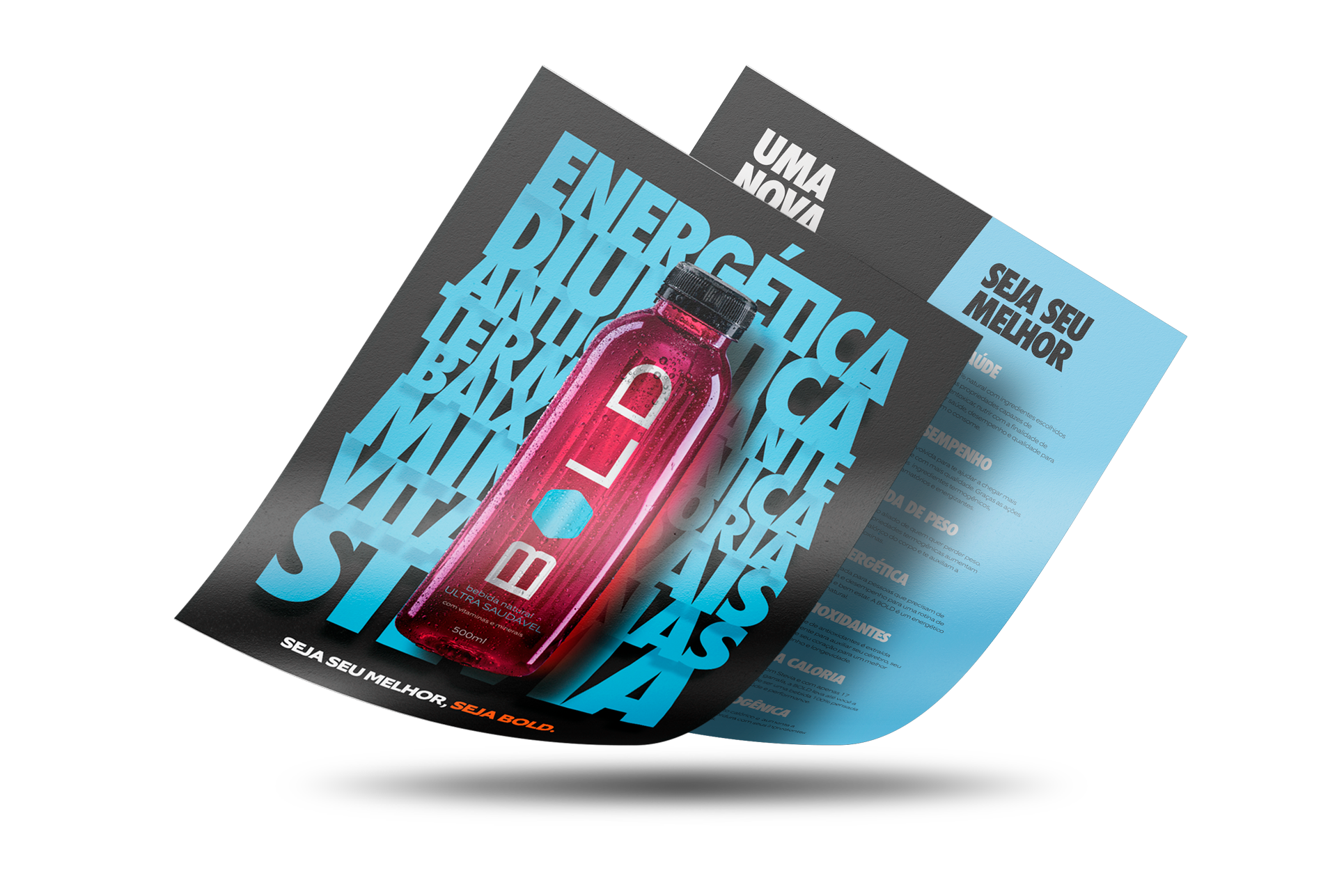
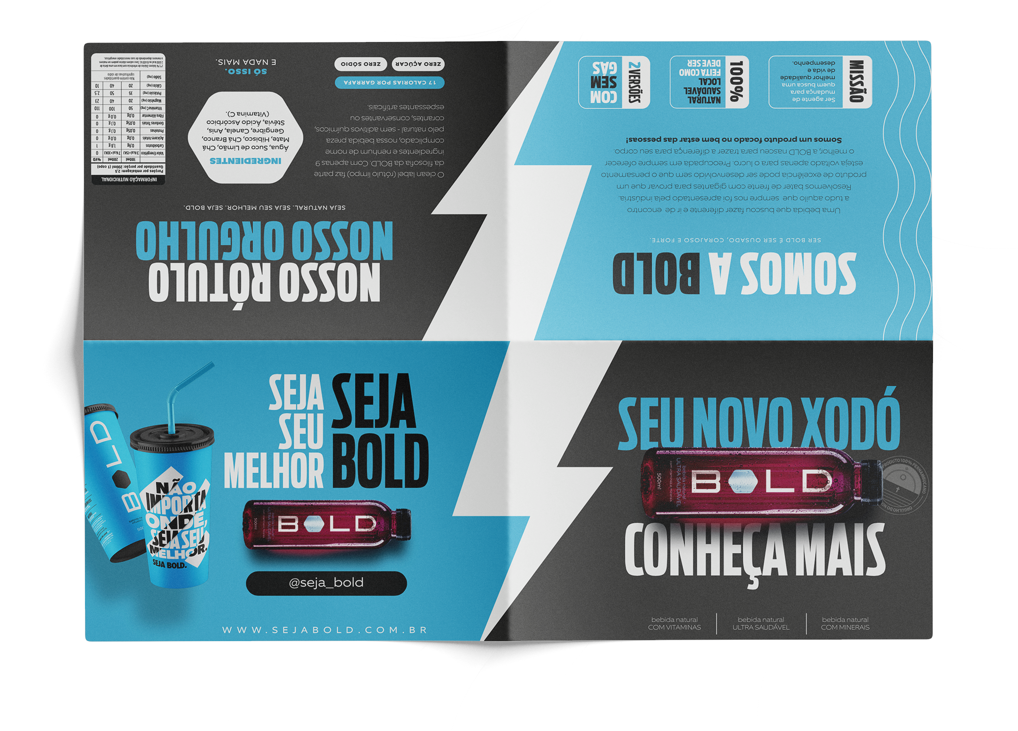
CARREFUL DESIGN IN EVERY DETAIL
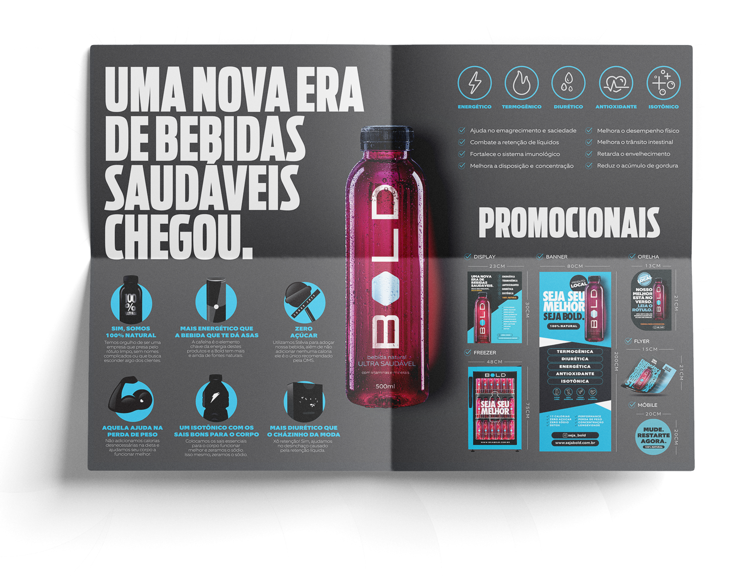
Une iconographie propre et soigneusement développée pour une meilleure compréhension du produit et de ses caractéristiques a été élaborée. Son application principale est dans les emballages et matériaux de support pour les points de vente.
An own and carefully developed iconography for a better understanding of the product and its characteristics was elaborated. Its main application was the application in packaging and support material for points of sale.
A WALKING LIVE MEDIA
OUR CAR FLEET
L'une des principales présentations de la marque est devenue le parc automobile qui a été soigneusement choisie pour attirer l'attention des tous et également comme une excellente exposition de la marque. Les voitures de la marque Fiat modèle 500 ont été choisies pour leur design et appliquée la couleur bleue de la marque.
One of the brand's main presentations became the car fleet that was carefully chosen to attract people's attention on the streets and also as an excellent brand exposure. Cars of the Fiat brand and model 500 were chosen for their design and were adhered in the blue color of the brand.
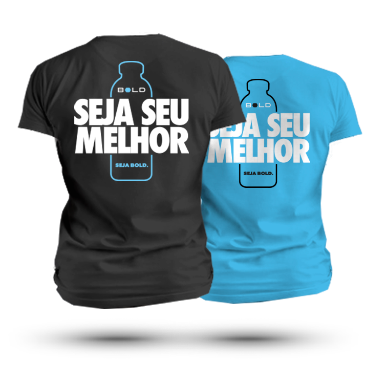
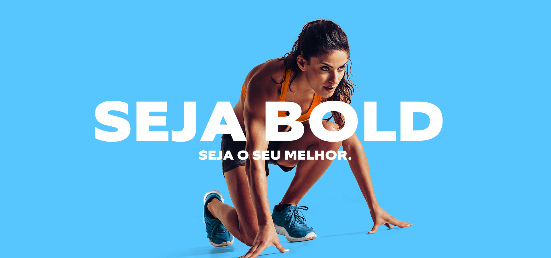
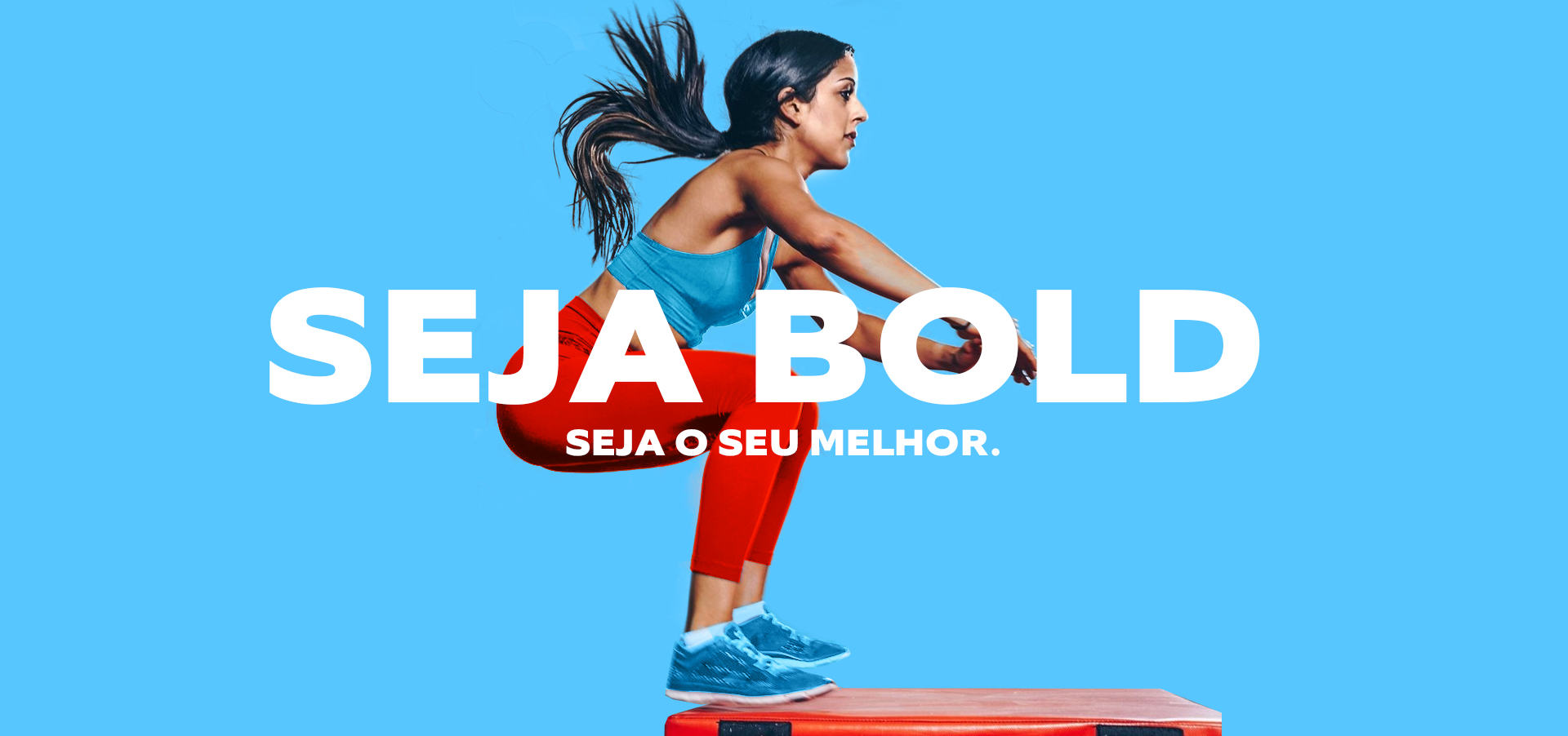
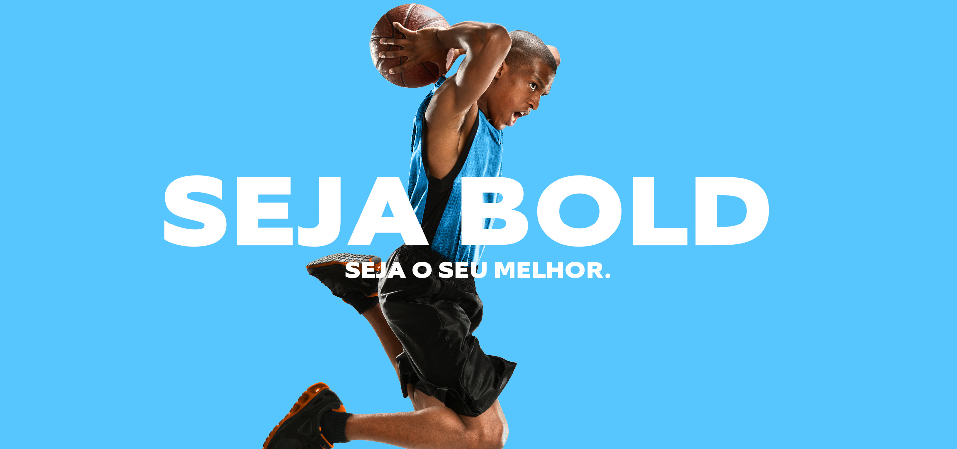
OUR SPIRIT AND WEARABLES
PRODUCTS
Le matériel promotionnel développé a l'objectif de transformer les personnes qui les utilisent en véritables annonceurs de la marque. Les athlètes et les influenceurs numériques portaient notre devise et ont emmené le concept de la marque dans tous les coins de la ville de Recife, et pour des événements dans le pays qui ont suscité l'intérêt de tout le monde.
The promotional material developed aimed to transform the people who used it into real brand advertisers. Athletes and digital influencers wore our motto and took the concept of the brand to all corners of the city, for events in the country that sparked interest from around the world.

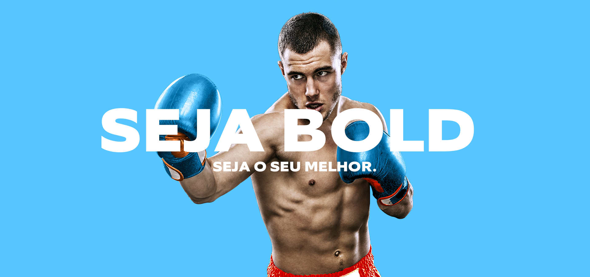
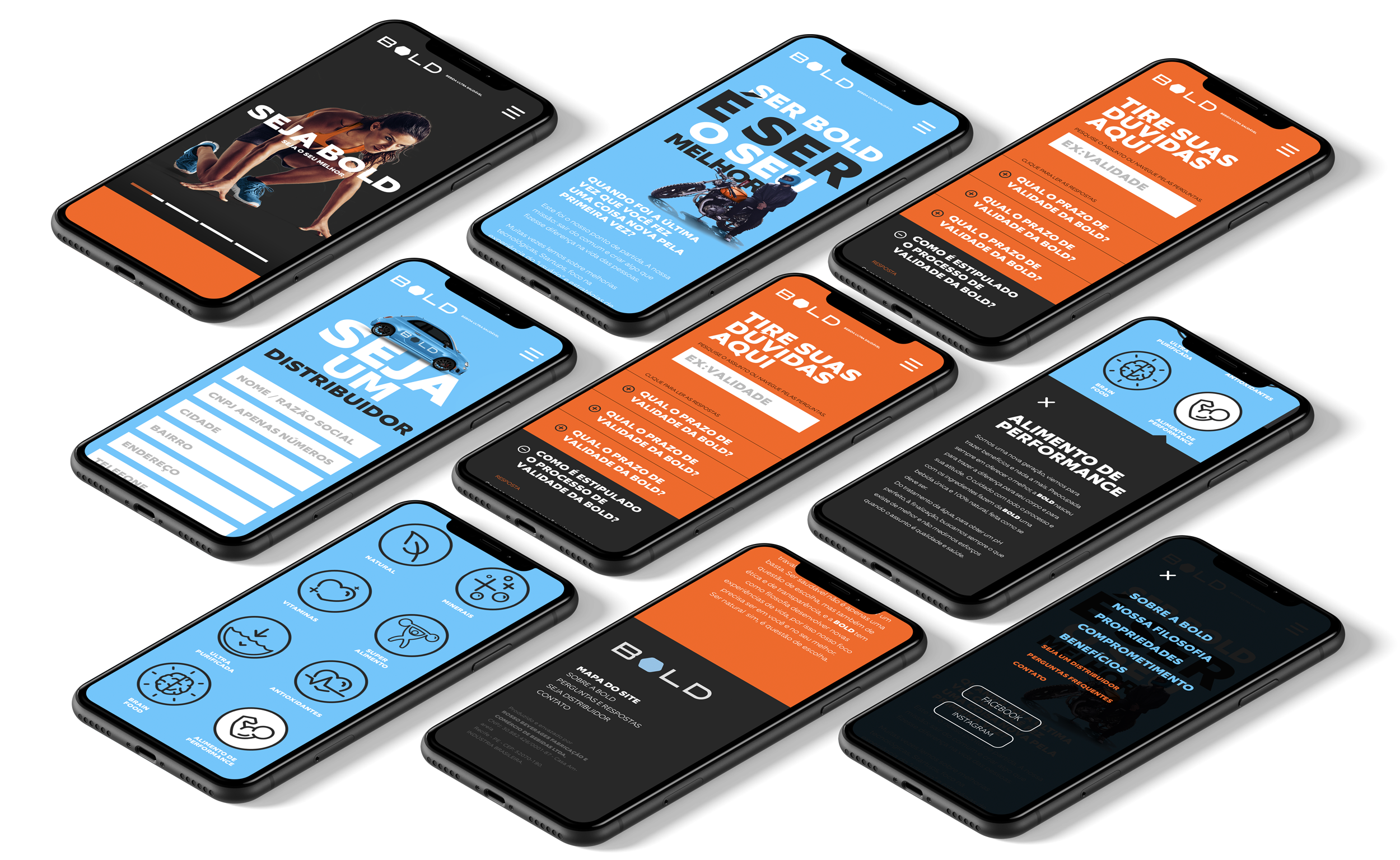
WEB AND DIGITAL POSITIONING
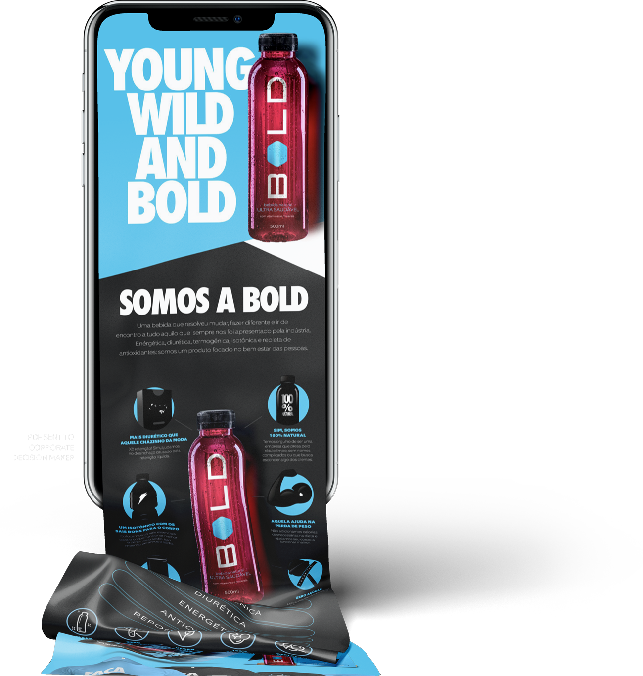
Le site internet de la marque a été crée en ténant compte sa principale caractéristique, être audacieuse. Pour cela, des photos fortes et les couleurs marquantes de l'identité ont été utilisées. Simple dans sa forme, audacieux dans son contenu et afin de mieux expliquer le produit et son esprit audacieux, le projet a été conçu à l'utilisateur qui recherche des informations.
The brand's website would have to take its main characteristic, be bold. For this, strong photos and the strong colors of the identity were used. Simple in form, bold in content and in order to explain better about the product and its bold spirit, the project was designed for the user who seeks information.
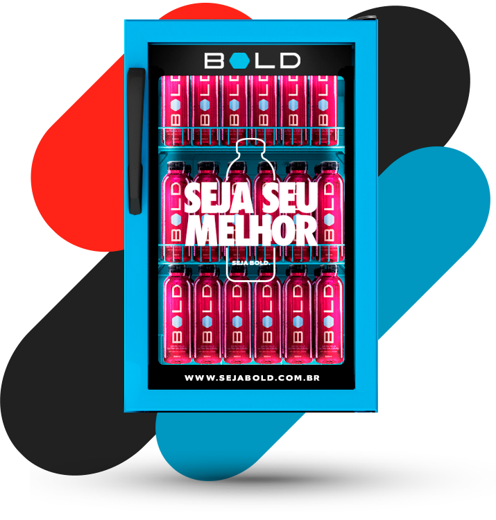
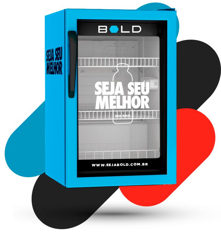
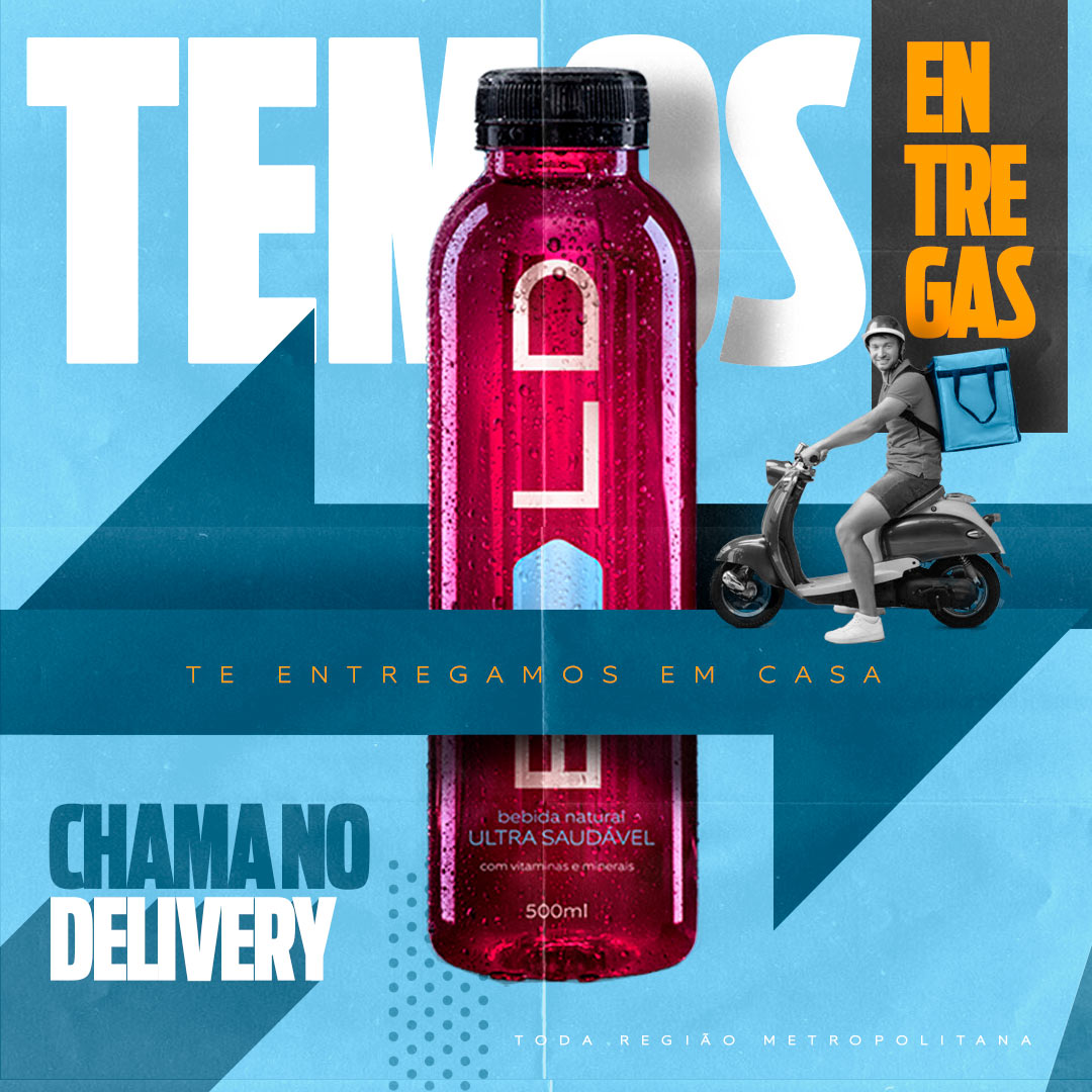
WHERE THINGS REALLY HAPPEN TRADE & PDV
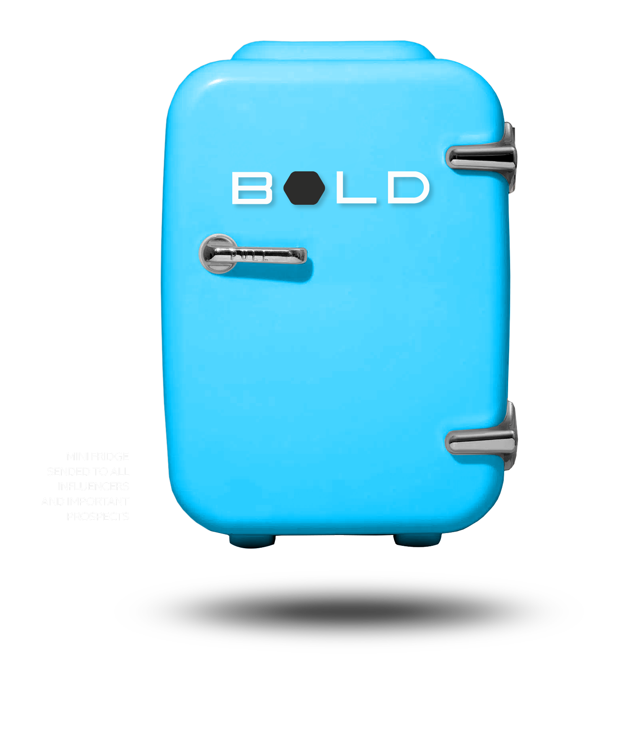
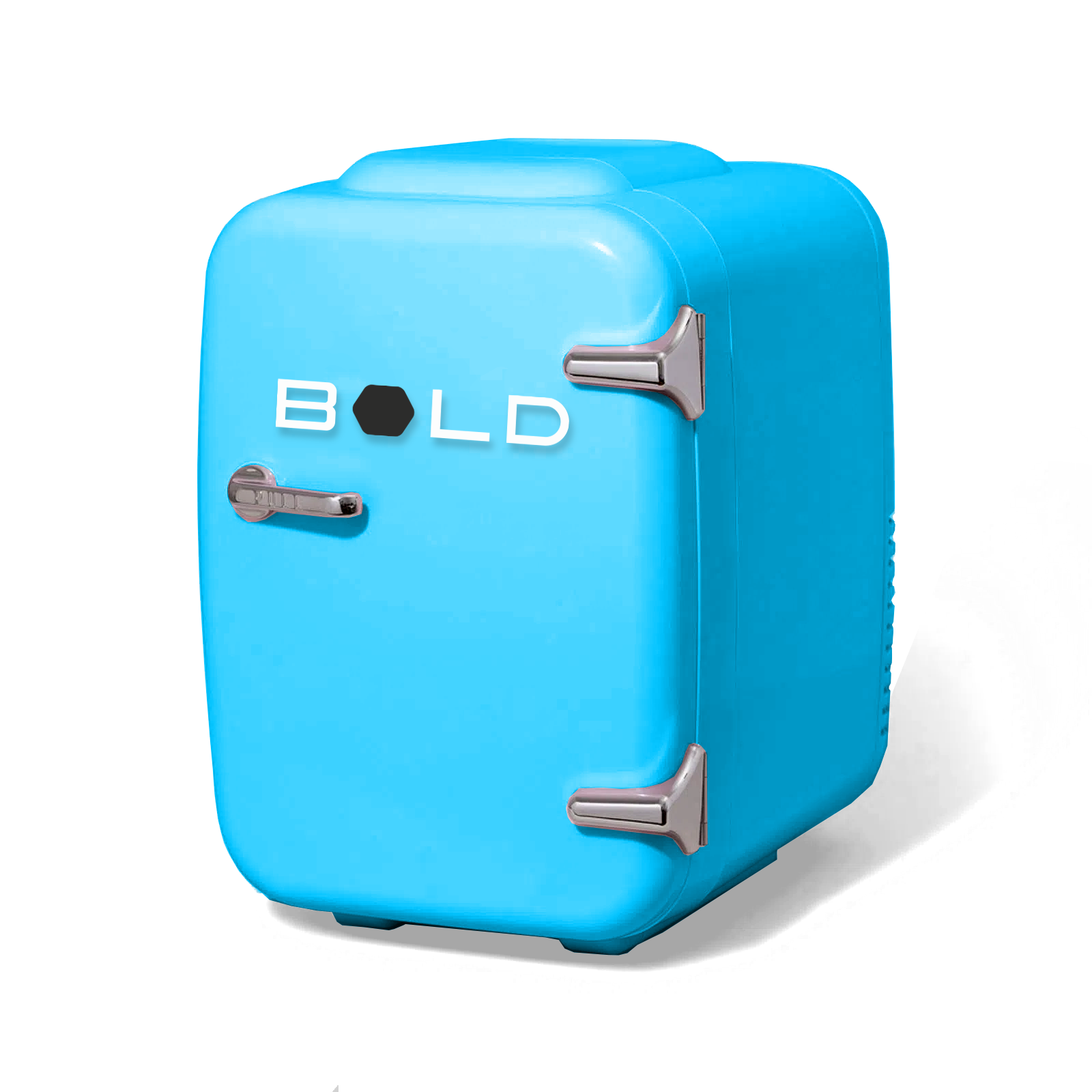
Tout le matériel à la commercialisation a un seul objectif, attirer l'attention sur la qualité et se démarquer des autres. Pour cela, j'ai développé des réfrigérateurs aux couleurs de la marque, des écrans lumineux et un support pour permettre aux consommateurs de mieux comprendre le produit et ses caractéristiques.
All material that was developed for the trade has a single objective, to call attention to quality and stand out from the rest. For this I developed refrigerators with the brand's colors, illuminated displays and a support material for consumers to understand a little more about Bold and its characteristics.
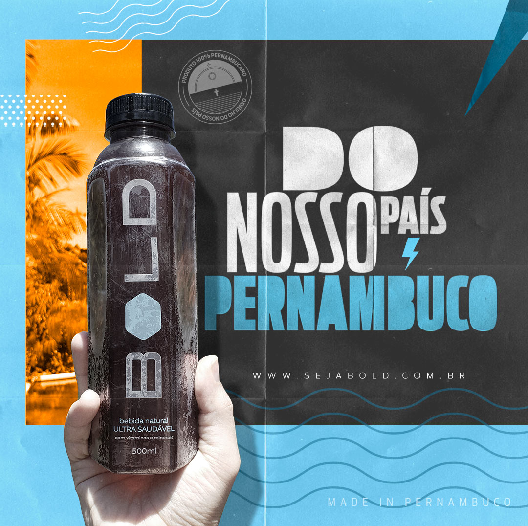
THE SOCIAL DILEMA AND PRESENTATION
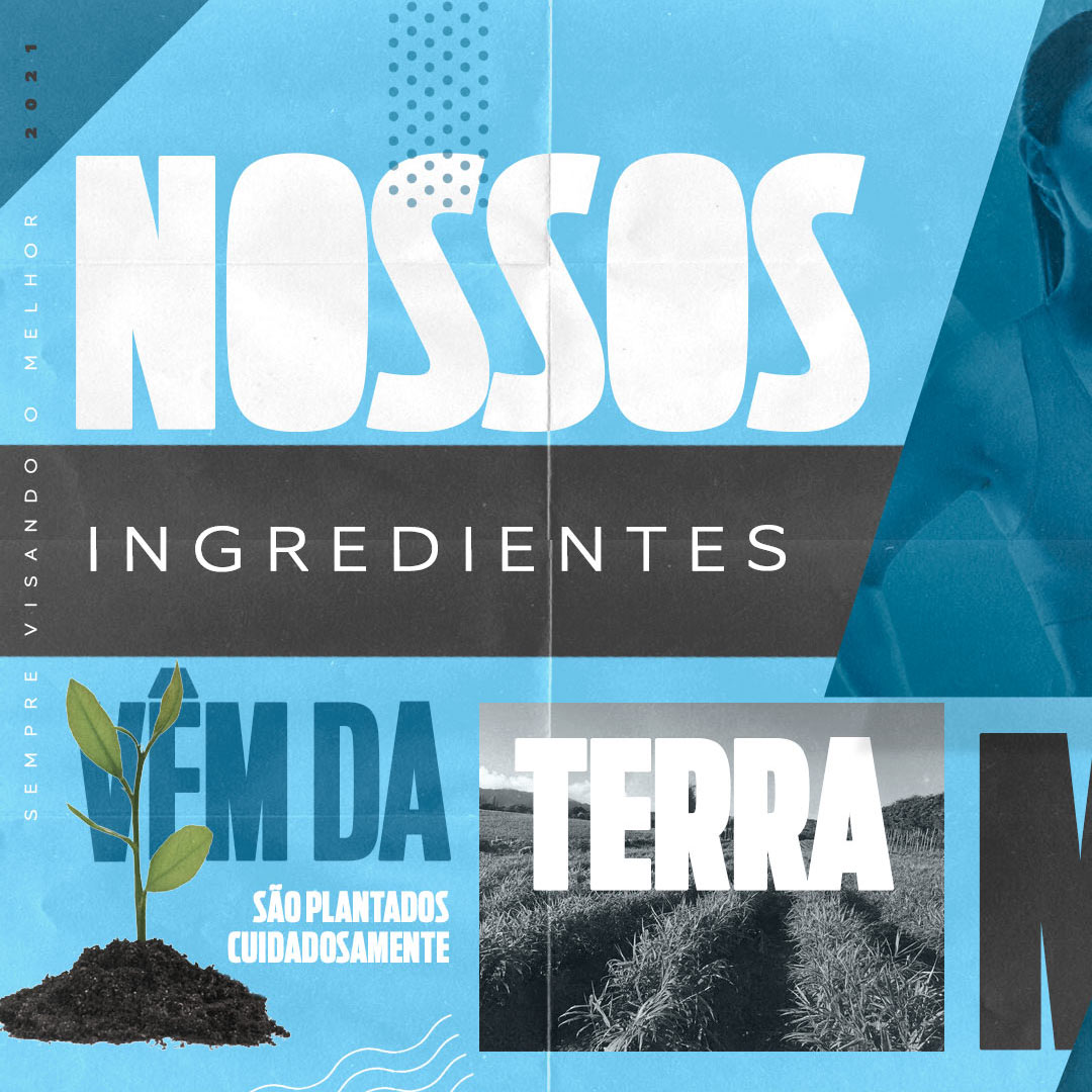
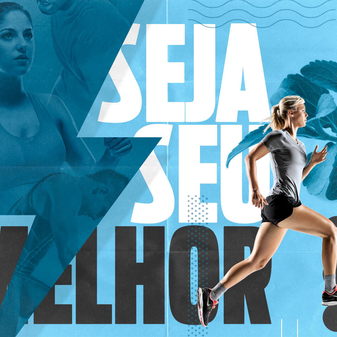
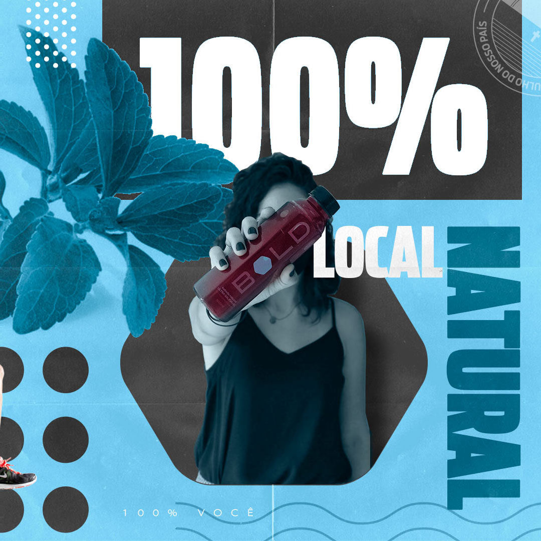
Pour les réseaux sociaux, j'ai défini que certaines des principales caractéristiques de la marque, ainsi que ses propriétés, devaient être mises en évidence. Des messages explicatifs, parlant de ses propriétés, comme Stevia, ou du concept de marque «Be your best» ont été créés afin de montrer au public la raison de l'existence de la marque.
For social networks I defined that some of the main characteristics of the brand, as well as its properties, should be highlighted. Explanatory posts, talking about its properties, like Stevia, or about the brand concept “Be your best” were created in order to show the public the reason for the brand to exist.
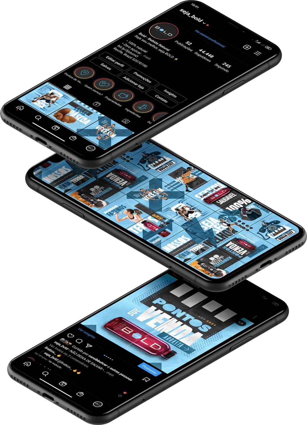
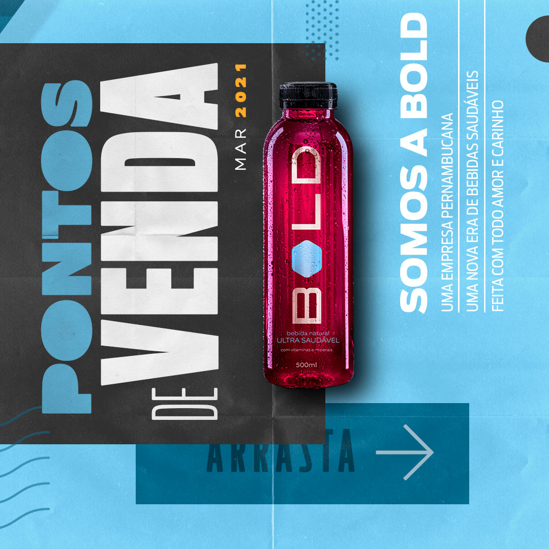
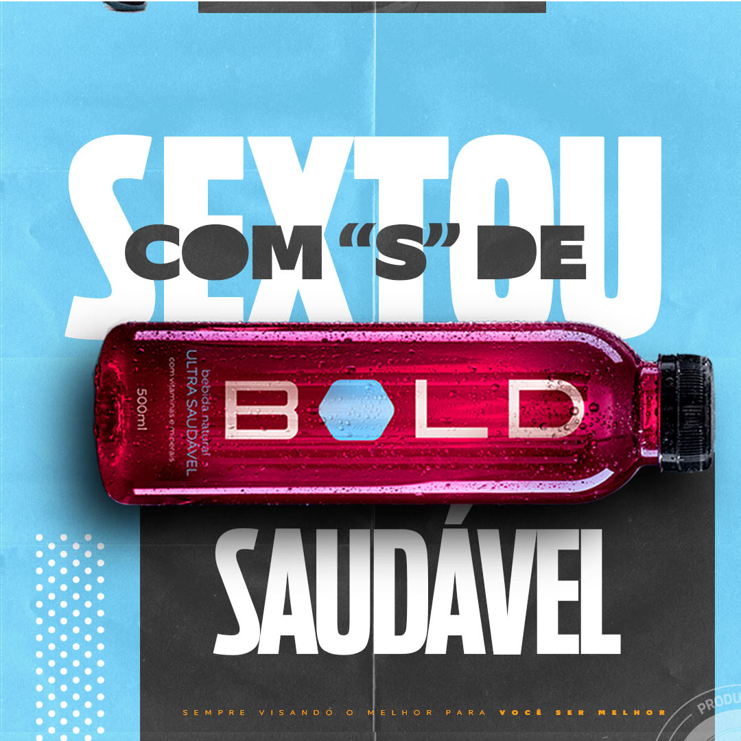
OUR POST LINE
Une ligne de direction artistique plus jeune et plus agressive, avec des textures et des couleurs primaires de la marque pour créer une identité encore plus marquante dans la timeline des clients.
A younger and more aggressive line of art direction, with textures and primary colors of the brand to create an identity even more prominent in the chronology of the clients.
PROSPECT MATERIALS
Tout le matériel à la commercialisation a un seul objectif, attirer l'attention sur la qualité et se démarquer des autres. Pour cela, j'ai développé des réfrigérateurs aux couleurs de la marque, des écrans lumineux et un support pour permettre aux consommateurs de mieux comprendre le produit et ses caractéristiques.
All material that was developed for the trade has a single objective, to call attention to quality and stand out from the rest. For this I developed refrigerators with the brand's colors, illuminated displays and a support material for consumers to understand a little more about Bold and its characteristics.

If you have a great idea and want to make it happen, or want to reposition yourself in the market with new experiences and results send me an email.
All rights reserved